SYMANTEC WEB SECURITY WEBSITE
RESEARCH, STRATEGY, UX DESIGN, VISUAL DESIGN

differentiating & unifying cybersecurity software

gotomedia partnered with Symantec to help to create a comprehensive Website Security website and unified front for Symantec Security Solutions and SSL offerings. The SSL market was becoming commodified and SSL products required repositioning to prove value. Security products needed feature clarification and differentiation between similar Symantec products. Using insights gathered from user research and stakeholder interviews, gotomedia created a new home for Symantec Website Security products that strategically differentiated from competitors while clarify product features.
A grid of three photos depicting a laptop, camera equipment, and a person interacting with a mobile phone.

research

revealing perceptions & needs

In order to better understand the pain points for consumers of website security products and SSL certificates, gotomedia conducted user research across a range of Symantec security and SSL brands. Several user segments were interviewed in order to dig deeper into needs according to role, technical ability and company size and to discover knowledge gaps and unmet needs. Internal Symantec stakeholders were interviewed to gain insight into business goals that informed strategy for the information architecture. A competitive analysis rounded out the research phase by providing perspective into the website security product landscape.

strategy

differentiation in an ambiguous marketplace

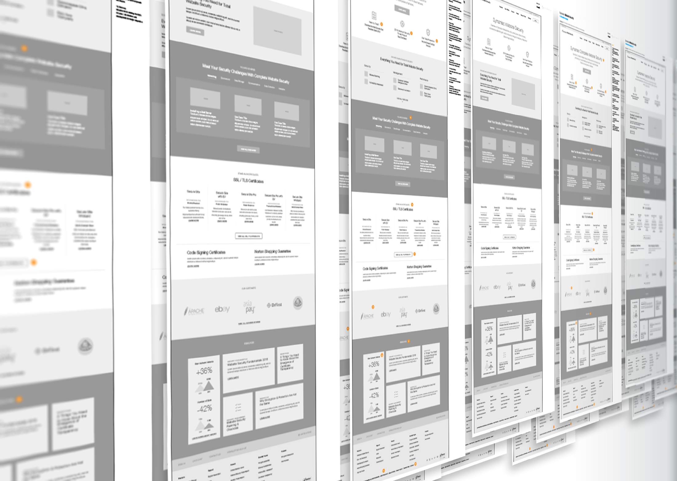
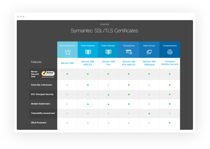
We helped buyers understand differences in product offerings by clarifying the relationship between product as well as with the larger security product suite. This extended beyond SSL to other Symantec security offerings.
Grouping of several wireframes depicting the Symantec website design.

ux

cybersecurity wayfinding

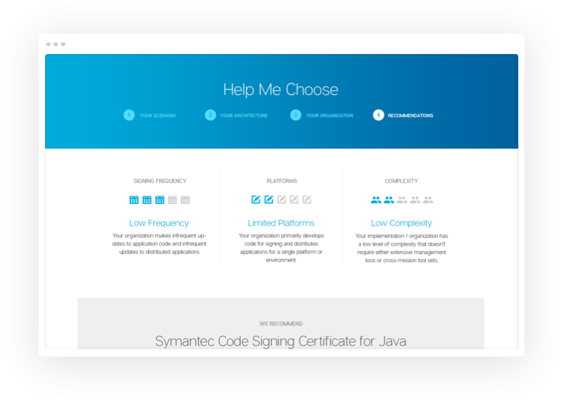
We needed a clear differentiation of products and alternative pathway mapping to get visitors to the right product. The resulting UX solution provided assistance in confidently choosing the most cost effective and beneficial product to best meet website security needs.
Open laptop sitting on a desk with the Symatec Security Topics web page displayed.

visual design

creating a parent/child brand connection

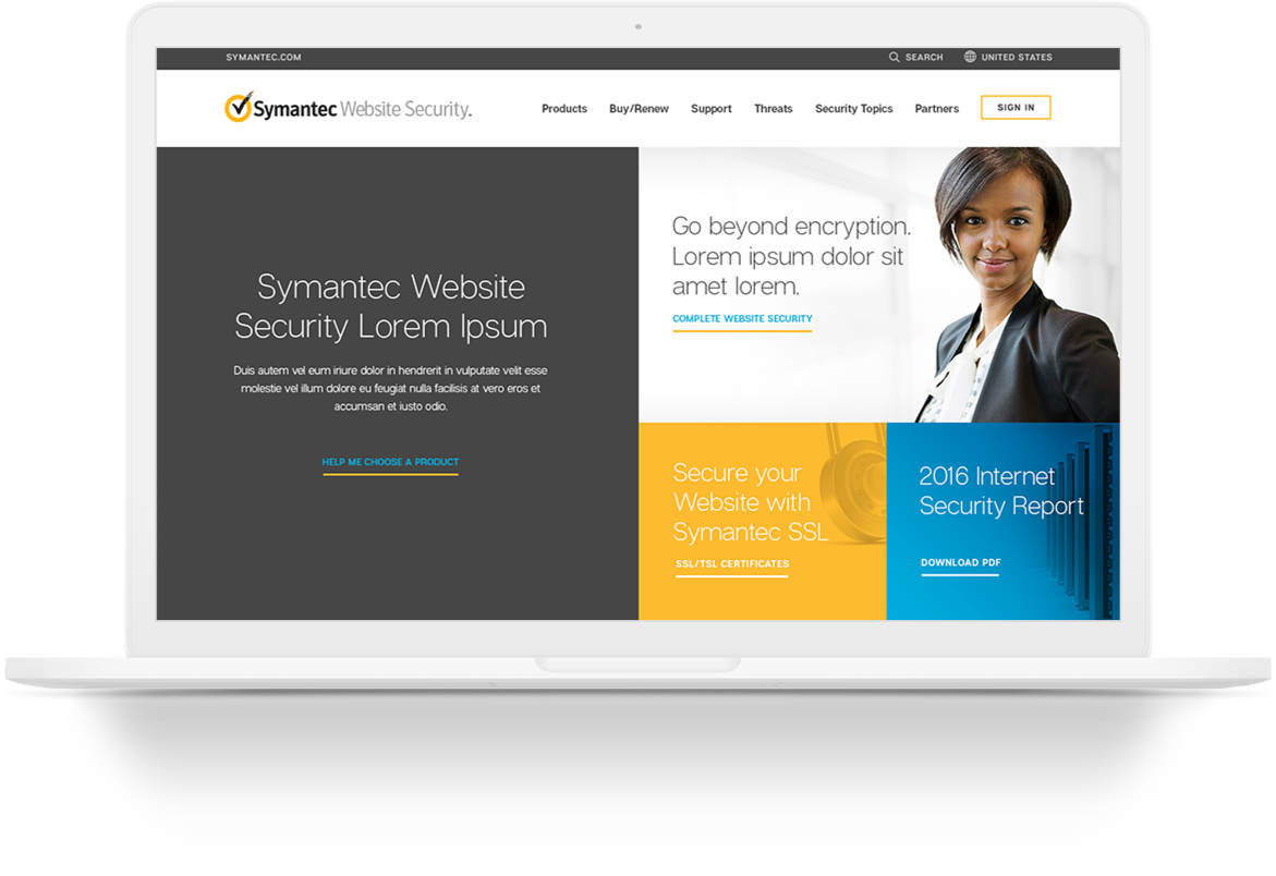
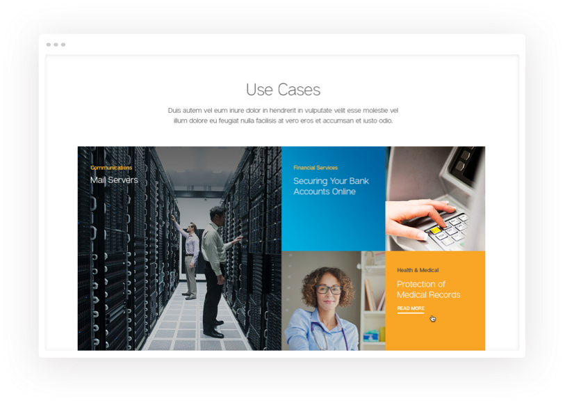
The main visual design focus for the WebsiteSecurity site was to create visual differentiation while maintaining some relationship with the parent brand. This involved integrating the Symantec "gold" color, but moving towards a unique photography style and a fresh and updated look and feel. The client also requested a stronger message about website security distinctive from Symantec enterprise security while also featuring their global leadership credentials.
Symantec website screenshot — Homepage
Symantec website screenshot — Use CasesSymantec website screenshot — SSL/TLS CertificatesSymantec website screenshot — Help Me Choose

have a project for us?